
Calm
Today we're examining Calm's user experience and interface design from the perspective of a new user seeking help with sleep. We'll follow the journey from app store discovery to regular usage, analyzing every touchpoint and interaction along the way.
Note: This is made with Claude summarizing my YouTube video transcript with slight editing and organization from me, so don't expect beautiful writing. This is intended to be a short and snappy summary of the video. Therefore, I reccomend you watch the video first and come back here for review.
App Store Presence
The app store serves as a critical first impression for potential users. According to research, approximately 48% of users discover apps through app store browsing, while only 33% find apps through social media or search engines. This makes the app store presence a crucial marketing channel that deserves significant attention.
What I Don't Like:
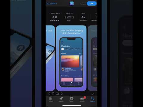
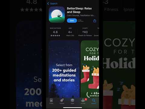
- Outdated Preview Page: Comparing Calm to competitors like BetterSleep reveals a stark contrast in app store presentation. While Better Sleep offers an engaging video preview showing product features, holiday references, and clear value propositions, Calm relies on static images that barely show the app interface. The preview feels like it hasn't been updated since their 2017 App of the Year award.
- Poor Visual Clarity: The current preview images make it difficult to see the actual app interface. The tagline "sleep more and stress less live better" is particularly hard to read due to small text size and poor contrast. This crucial messaging gets lost in the presentation.
- Missing Video Preview: The app store now supports brief preview videos, but Calm hasn't taken advantage of this feature. Competitors are using 10-15 second demos that effectively showcase their features and benefits, creating a more engaging first impression.
- Dated Achievement Focus: Calm prominently displays its "App of the Year 2017" achievement, which feels increasingly irrelevant in 2024. This valuable space could better serve users by highlighting current features and benefits.
- Lack of Visual Impact: The current design fails to leverage the Von Restoff effect, where distinctive elements naturally catch the eye. BetterSleep's video preview immediately stands out and creates interest, while Calm's static blue background with small images fails to capture attention.
What I Recommend:
- Create Engaging Video Content: Develop a 10-15 second video demo that shows the app in action, including features like meditation interfaces, sleep stories, and the calming visual design. This would help potential users better understand what they're downloading.
- Update Visual Assets: The preview images need a complete overhaul with clearer, more visible content. Text should be easily readable, and screenshots should better demonstrate the app's functionality and design.
- Modernize Presentation: Take full advantage of current app store capabilities. This is a relatively low-effort, high-impact investment compared to ongoing marketing efforts like social media and SEO. A well-designed app store page serves as a permanent digital billboard.
- Regular Updates: Implement a system for regular app store presence updates, perhaps every six months or when Apple releases new preview features. This ensures the store presence stays current and effective.
Initial Onboarding
The onboarding experience critically influences user retention and engagement. Here's a detailed look at Calm's current approach:
What I Don't Like:
- Premature Notification Requests: Immediately upon opening the app, users face a notification permission request. This comes before they understand why they might want notifications or what value the app provides. According to various sources:
- Push notifications can boost engagement by 88%
- 65% of users return within 30 days when notifications are enabled
- Users with notifications enabled show 4x better retention after three months (16% vs 4%)
- 60% of users say push notifications increase their app usage
- Permission Overload: Following the notification request, users immediately face a tracking permissions popup. This rapid succession of permission requests creates unnecessary friction and potential privacy concerns before establishing any trust with the user.
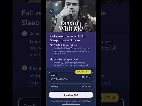
- Early Premium Push: The app quickly presents a premium subscription offer showing "50,000 minutes of audio designed to relieve anxiety, stress and more" without users understanding what this means or experiencing any content. The exit button is subtly placed in the top left corner, making it easy to miss.
- Stressful First Experience: After the initial "take a deep breath" message, users face multiple popup requests for permissions and subscriptions. This creates a stressful environment that contradicts Calm's core purpose. For an app focused on reducing stress, this aggressive approach feels particularly misaligned.
What I Like:
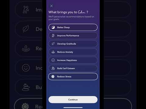
- Initial Question: The "What brings you to Calm?" question effectively gathers user intent while demonstrating a commitment to personalization. The app promises to "personalize recommendations based on your goals," making the data collection feel beneficial to the user.
- Clear Value Communication: The app effectively communicates how it will use responses to customize the experience, creating anticipation for personalized content.
- Thoughtful Follow-up: The promise of personalized recommendations creates a clear value proposition for sharing preferences.
What I Recommend:
- Delay Permission Requests: Wait to request notifications until after users have experienced value. A natural moment would be after completing their first meditation or when setting up daily check-in reminders.
- Streamline Initial Experience: Start with the personalization questionnaire before any permission requests or premium offers. This establishes value and trust first.
- Natural Permission Integration: Integrate permission requests into relevant features. For example, ask for notification permissions when a user sets up their first daily reminder or meditation schedule.
- Demonstrate Before Selling: Hold premium offers until users have experienced core features. Consider showing the premium offer after users complete their first free session and express satisfaction with the experience.
Main App Interface
What I Like:
- Ambient Audio: The app includes subtle cricket sounds in the background while browsing, creating an immediately calming atmosphere that reinforces the app's purpose.
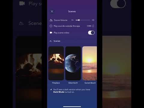
- Scene Customization: Users can choose from various background scenes like Yosemite, Jasper Lake, and others, with different color schemes for different times of day. This allows for a personalized, calming environment.
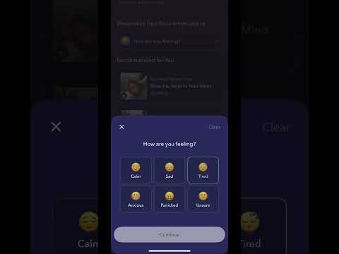
- Mood-Based Content: The app offers content recommendations based on current mood, making suggestions more relevant and personal. For example, if a user indicates they're feeling tired, they might see videos and lo-fi beats designed to help reset attention.
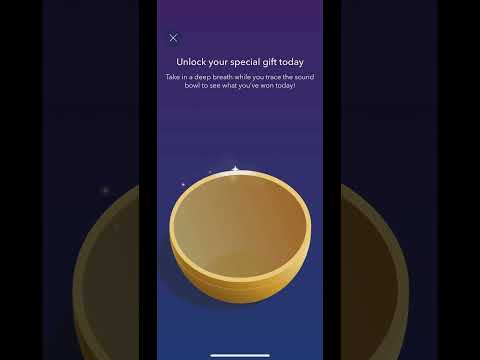
- Daily Gift Feature: The interactive sound bowl feature serves as an engaging daily gift, encouraging regular app visits. The interactive nature of tracing the sound bowl creates an engaging experience rather than just opening a static reward.
What I Recommend:
- Dynamic Backgrounds: Implement auto-updating backgrounds based on time of day. For example, showing Denali or Yosemite in the morning and afternoon, then transitioning to Jasper Lake or waterfall scenes at night. Include a toggle option for users who prefer manual control.
- Optimize Content Discovery: Move personalized recommendations higher in the interface hierarchy, making them more accessible. The current placement at the bottom of the page reduces their visibility and utility.
- Highlight Key Features: Make meditation for beginners more prominent, possibly featuring it on the homepage rather than burying it in the discover section.
Re-aligning Content and Increasing Conversions
What I Like:
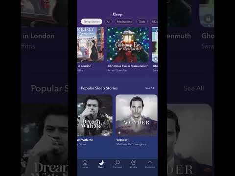
- Celebrity Narrators: The app features an impressive roster of celebrity narrators, including Harry Styles, Cillian Murphy, and Matthew McConaughey. These high-profile collaborations add significant value and appeal to the content library.
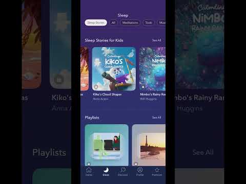
- Content Organization: The sleep content is thoughtfully organized into distinct categories:
- Train journeys (like the Darjeeling Himalayan Railway and Amsterdam canals)
- Nature stories
- Fictional sleep stories
- ASMR content
- Visual Quality: The thumbnails are particularly well-executed. For example, the Glacier Express thumbnail transforms what could be a simple train journey into an evocative "Train to the North Pole" experience. These high-quality visuals help users better understand and connect with the content.
- Content Variety: The range of content types effectively addresses different preferences for falling asleep, from ambient sounds to storytelling to guided experiences.
What I Don't Like:
- Hidden Premium Content: Users can't preview any of the celebrity-narrated content before committing to a subscription. If someone is excited to try a Harry Styles narration, they must commit to a free trial without hearing even a sample.
- Buried Popular Content: Celebrity-narrated stories, which could be a major draw for new users, are placed below "Featured" content rather than at the top where they might have more impact. These videos are much more intriguing to click on than general sleep content.
- Underutilized Kids Content: The children's sleep stories section is buried several rows down, despite potentially being one of the most valuable features for parents. This content could be a significant driver of subscriptions, as parents might subscribe simply to help their children sleep better.
What I Recommend:
- Preview System: Implement a freemium model where users can experience 2 minutes of any sleep story. This gives users a taste of premium content without giving everything away in a free trial. Users will start a 20 minute sleep story with Harry Styles and then be asked to sign up for premium to continue, which I suspect would have high conversion as many users will wannt to finish the story they're currently enjoying. Also, it limits the risk of users listening to all of the most interesting content during the free trial and not seeing the benefit of converting to a paid subscription.
- Content Hierarchy: Move popular sleep stories, especially celebrity-narrated content, to the top for new users. This immediately showcases high-value content that might drive conversion.
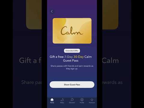
- Kids Content Focus: Create a dedicated bottom navigation tab for children's content, replacing the redundant Premium tab (since premium promotions appear throughout the app anyway). This could include:
- Age-appropriate content categories
- Mood-based recommendations for children
- Parent-focused features and tracking
- Parent-Focused Marketing: Develop stronger marketing messaging around the app's value for families. Parents might subscribe not just for themselves but for a solution that helps their children sleep better, potentially making this a stronger value proposition than individual use cases.
Profile and Statistics
What I Don't Like:
- Surface-Level Metrics: The current statistics show total sessions, mindful minutes, and streaks, but these numbers don't provide meaningful insight into the app's impact on wellbeing or sleep quality.
- Basic Calendar View: The calendar shows activity days but doesn't connect this activity to outcomes or benefits, making it less meaningful for users.
- Limited Retention Mechanics: The streak feature feels like a shallow attempt at gamification without providing real value or motivation.
What I Recommend:
- Wearable Integration: Partner with devices like Oura Ring to provide concrete data on how Calm usage impacts sleep and stress levels. This could include:
- Before/after heart rate comparisons for meditation sessions
- Sleep quality scores on nights with/without using Calm
- Weekly and monthly trends in sleep and stress metrics
- Impact Visualization: Create a more meaningful calendar view that shows:
- Pre-session vs. post-session mood/stress levels
- Sleep quality on nights when Calm is used
- Correlation between consistent app usage and improved metrics
- Meaningful Insights: Replace basic usage statistics with impact metrics that help users understand how the app is improving their wellbeing.
Premium Features
What I Don't Like:
- Inconsistent Pricing: The app shows different pricing offers at different times - offering 50% off initially but then showing full price later in the same session. This creates confusion and potential frustration.
- Limited Preview Access: The complete lockout of premium content makes it difficult for users to assess value before committing.
- Referral Imbalance: The referral program offers 30 days free to new users while current users only get 7-day trials, which could feel unfair to existing users.
What I Recommend:
- Consistent Pricing: Maintain consistent pricing offers throughout a user's session. If a discount is offered, honor it throughout that session.
- Preview Model: Instead of a complete free trial, offer preview access to premium content:
- 2-minute previews of any sleep story
- Sample meditations from different categories
- Limited access to popular features
- Balanced Referral Program: Create a more equitable referral system that rewards both parties equally and clearly communicates the benefits to the referrer.
Biggest Questions I'd Love to Ask the Calm Team
Calm has built an impressive foundation with high-quality content and a generally well-designed interface. However, several opportunities exist to enhance both user experience and business outcomes:
- Why Go with a Full-Access Free Trial rather than Previews?
- Why Not Showcase Kids Content More?
- Have You Looked into Partnerships with Wearables like Oura Ring?
- Why Bombard Users with Pop-ups Immediately rather than Organically
Overall, Calm is a beautiful app visually, but I think there's a lot of room for improvement for user experience, content discoverability, and revene generation.