
Strava
Today, we're diving into Strava's design and user experience to analyze what makes this app stand out as one of the best-designed fitness tracking platforms. We'll explore the app store presence, onboarding process, and user interface, highlighting what works, what doesn't, and areas for improvement.
Note: This is made with Claude summarizing my YouTube video transcript with slight editing and organization from me, so don't expect beautiful writing. This is intended to be a short and snappy summary of the video. Therefore, I reccomend you watch the video first and come back here for review (Actually, this one had much more intervention by me than the Calm one, so expect better writing).
App Store
What I Like:
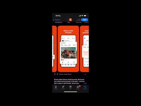
First, the bright orange is certainly a power color that sticks out. I love that choice as it's an energetic color that draws a potential user's attention. Few apps use orange as a primary color as it can be a little too overbearing, but for Strava, a social exercise tracking app, I think it's perfect.
Next, the brief video demo they have on their app page is fantastic. It's entertaining, visually stunning, and highlights all of the unique and incredible features that Strava boasts. As I mentioned in my Calm analysis, every app should have a demo showcasing its best features as Strava does. Then, the rest of the app images are informative and unique to any other running app, making Strava really stand out.
I don't think I would change anything, and if I were a founder, I would replicate this page as closely as possible. Study it and replicate it.
What I Don't Like:
Nothing
What I Recommend:
Nothing
Rating: 10/10
Onboarding
What I Like:
No annoying initial pop-ups on the first page like we saw with Calm. Just a page that reminds us why we're signing up for Strava, with some highlighted features and nice images. Not much to it, but it's a nice intro page to get a user excited to sign up because, while I'm sure it's a small number, it's a non-zero number of users who leave after seeing the first screen of an app, so don't overlook it. Every optimization counts.
"Allow Strava to track" is asked at a fine time. It's never a good time to ask, but I appreciate that they at least let me confirm I want to join and set up an account first. Also, I think they put the popup in a good place in terms of right before the "Tell Us Who You Are" page so that a user will just quickly click yes or no and move on with completing their profile.
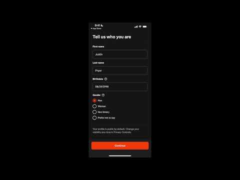
Well done by Strava to ask me what sports I'm interested in and give me tons of options to help me realize I can use Strava for more than just running, but also for swimming, for example, or bike riding, making the app an even better experience for me, as them asking for this information makes me assume they will cater the app towards my interests.
Also, as we covered in the Calm analysis, asking a user why they're coming to your app is really important data to get in terms of what users you're attracting and what segments are growing MoM or YoY to see where you should most cater your marketing messaging or where you should be investing more marketing dollars—if swimming users have increased from 5% of total users to 15% in one year for example. Also, the different icons just make it a little more fun; a nice little detail.
The notification page is solid. I like that it at least explains a little bit why you should allow notifications rather than just throwing the generic pop-up on the screen like Calm did. The image on the top of the screen is really nice, showing why you'd receive a notification and what it would look like; I would replicate that for my app.
I also like that the user can click allow, which will cause the generic Apple notification banner to appear, or users can click not now, to not see that banner pop up and give Strava future opportunities to ask to send notifications, like when a user joins a running group, so Strava can then say “Do you want to see notifications about how you're doing in your running group compared to others? Allow notifications to get alerts about your position in the standings.” That's another great time to ask, so by allowing the user to avoid the pop-up now, you save it for future use at organic times.
What I Don't Like:
Nothing
What I Recommend:
I think what would make the notification page even better is to make that top screen swipeable. Show what notifications for monthly stats would look like while showing a graph tracking data in the app, what new feature update notifications would look like, and what stories from the community would look like.
Rating: 9/10
Free-Trial Page
What I Like:
First, I think a 30-day free trial is very nice. It seems like there is a free version of the app, as you're able to skip this page, but after using the app, it seems to warrant a subscription price, so I completely understand paying for an app like this, as it is extremely feature-heavy. So, the fact that they're giving 30 days is generous, but I'm sure it is an effective strategy by Strava to lock in a user after they fall in love with all the features. Seven days, like Calm, doesn't seem long enough for Strava since the user has to go on runs, which they may only do once or twice a week, and they have to get addicted to the "ah-ha" moments to pay $80 a year for the app.
Next, I love the trial end reminder that they send in 28 days for two reasons. First, most people are hesitant to do free trials because they're afraid they'll forget to cancel them and will have to beg to be reimbursed. That's always stressful, so Strava saying hey, don't worry about it, we'll remind you, is an excellent way to increase user trust that you will not hope they forget, instead, you will actively remind them, building trust.
This reminder method was used by Blinkist, which increased free trial conversions by 23%, as told by the excellent Growth Design team: https://growth.design/case-studies/trial-paywall-challenge
What I Don't Like:
Nothing
What I Recommend:
I wonder if they could spice up this page a little more by having an opaque picture in the background that's like a collage of the features, like a map showing routes or the social posts page, just to make it a little more exciting since this page itself is a little dull, and again, I don't know what the premium features are.
Rating: 9/10
Homepage
What I Like:
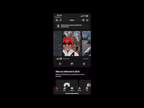
It's far from boring. There is a lot you can do and see on the homepage, as Strava shows you running influencers, friends, groups you're in, or pages you follow, much like a traditional social media app that uses the unlimited-scroll feature. You can basically see everything you need on the home page, and while it is fairly crowded, it is nice that basically everything you need is on the home page.
What I Don't Like:
It visually just isn't very appealing, both in the light and dark mode. Things just look dark and hidden due to how much there is on the initial page and how there aren't really any visual aids.
What I Recommend:
I would prefer if there were some more visuals on the page. For example, the record an activity seems to mean start a run, basically, so I would've liked if there was a small image of a live map right there to make that action a little more exciting, clickable, and clear, since "Record an Activity" is kind of vague language. Essentially, a condensed version of the maps tab.
I also think instead of just a black or white background, maybe do a rotating catalog of images I uploaded to the app from my runs at like a 20% opacity. I think it helps encourage posting in the app since you see your images rotating every 10 seconds or so (customizable), but I think that would make the screen a lot more interesting.
Rating: 6/10
Suggested Challenges
What I Like:
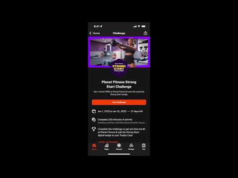
These are really awesome partnerships that Strava is creating, and I'm sure they are an extra revenue stream for them. Strava is partnering with companies like Planet Fitness, where if runners run a certain amount or do X minutes of exercise in a month, they get one month free at Planet Fitness. Obviously, Strava has an incredible network of athletes, so it's no wonder companies are trying to use that distribution network to sell their products. At the same time, people who want a free month at Planet Fitness or a Hello Fresh discount will be more inclined to use Strava more frequently to qualify for those challenges. It is a win-win for both companies in each partnership.
I also love how the pages are designed with the picture, objectives, and leaderboards; they look great and make you want to join. Also, it's so easy to join; all you have to do is click a button, and you're in. This is a genius move by Strava to increase engagement and potentially make some revenue from partnerships. It is a beautifully designed page that's easy for a user and excellent from a strategy standpoint.
What I Don't Like:
Nothing
What I Recommend:
Nothing
Rating: 10/10
Who We Followed in 2024
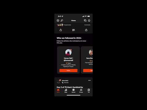
What I Like:
I think the mini-profiles look perfect. A nice image, the name, the country, and a brief description. I would probably copy that exactly if I were making a similar social profile component.
What I Don't Like:
This feature disappears after you start following people or clubs. I would still have that “suggested follows” section and update it with similar clubs or people I follow or friends from my contacts or Facebook page. For example, since I only follow one club, all I see are posts from the club. Obviously, I can go to another page to join more clubs or find more people to follow, but it would be easy just to have that on the homepage after one screen-length scrolling to encourage the user to keep following people.
What I Recommend:
There's not much to say here since it's a small feature. I do think, however, that it would be much more engaging for a new user to have their recommended friends, connect to Facebook, or connect contacts buttons in place of some of these random running influencers. Essentially, port all the content a user sees when they click the (unclear) magnifying glass button and put it directly in the Who to Follow section. It also seems like you can only swipe over four times, and then they stop showing you new profiles. I would show more accounts as it's probably interesting for users to see many people.
It's not clear that the magnifying glass button means add friends, as I discuss later, so it may be hard for a user to find how they can add friends. By having it in this section, it will be clear to users how to add friends, and it will be something they will immediately see on the homepage and can quickly add friends.
Overall, it looks great, but I believe a missed UX optimization to easily show users their friends or how to add them without having to click on any buttons or other pages.
Rating: 7/10
Top Buttons
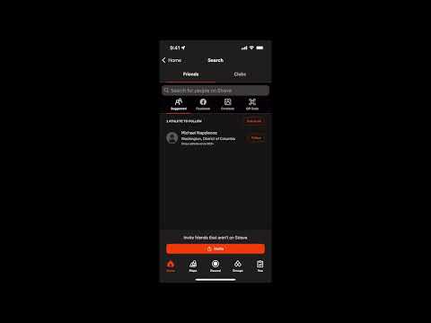
As I mentioned in the Calm analysis, the header buttons are some of your most premium real estate, so it's important to really make them count. I think Strava is overwhelming the user slightly by having four buttons up top instead of the typical two buttons, but sometimes, if you have a lot of features, that's just what you have to do.
In terms of the buttons themselves, I do think they're fairly necessary to be there as one is notifications, another is messaging (like DMing friends on Strava), and another is friends, which I think is really well done here.
You can see suggested friends, connect your contacts or Facebook friends, and scan a QR code if you just met someone new that you want to be friends with. So, there are plenty of ways to add friends, which is great. Also, on the friend page, you can find groups such as runners in NYC or Female Runners, or whatever, which is again a really fun social and competitive feature to see how you stack up in leaderboards.
The one thing I don't like about the friend button is that the icon is a magnifying glass, which is a little confusing. I would've preferred the duo emoji or something that symbolizes friendship a little more.
The last button, the plus sign, is a post feature that looks similar to Twitter, I assume it doesn't get used as much as a "share my run" button after an actual run, but I'm sure some people prefer to post after the fact when they have more time, or just want to post to all their followers to see if anyone wants to run tomorrow.
So, while there are a lot of buttons, I think they're all necessary to have at the top, and I like the way each button works; I would just change the magnifying glass for friends.
The Post
What I Like:
The posts look fantastic—visually appealing, engaging, and packed with details that draw you in. Even though I don't personally know the runner featured, it's fascinating to see the details of her run: the distance, pace, rewards, calories burned, tools she used, and more. I suspect it will be way more interesting once I have actual friends I follow.
I like how many different types of statistics they show like speed, splits, and elevation data. These stats are perfect for running enthusiasts who love to analyze their performance. Seeing these details, especially from someone who seems to be a serious marathon runner, is probably awesome to see for an aspiring or current marathon runner looking for people to compete against.
I also think it's great how users can tag one another in their posts, much like any other social network; however, Strava is more than just image sharing; it's also statistic sharing.
What Strava does exceptionally well here is combining social and analytical elements seamlessly. The post encourages interaction—through likes, comments, and sharing—and builds a sense of community.
I also love that Strava shows when a user completes their weekly distance goal, as well as showing achievements they earned on their run, encouraging you to give them kudos. Strava, despite being a run-tracking app, is perhaps the most engaging social app among users I've seen because of how much information is shared in these posts.
It's incredibly engaging for running enthusiasts while encouraging users to post their content and show off their hard work to their friends. It is all due to how much information is shared and how it is displayed in an engagement-based way, both quantitatively and visually.
What I Don't Like:
Nothing
What I Recommend:
Nothing
Rating: 10/10
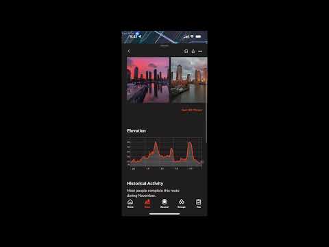
Map Page
What I Like:
This page is incredible. I love that they automatically highlight running routes around me and tell me their length and difficulty. It makes it so easy to get a run started by knowing where to go, which is extremely helpful for new runners. You can also change the routes by the desired length to find longer or shorter routes near you.
Also, the way the highlighted routes change as you select new ones is beautifully designed. It looks really exciting and way more interesting than just a general map and figuring out for yourself where you should run. This is an incredible page that makes a user way more inclined to go on a run and to continue using Strava to find new running routes. Whether you're a new runner and need some guidance on where to go, or you're an experienced runner looking for their new favorite route, this highlighted and filterable route feature is incredible.
Additionally, if you expand the route to see more information, you see pictures people have taken while running the route, which I love because I like to explore on runs, so it’s nice to see what I may see while on the run. I optimize my routes for their visual aspect, so I love this image feature from the community, and it would be fun to contribute to it on a run of my own.
It's also nice that Strava filters the runs as easy, moderate, and hard (along with length filters) by including factors like elevation instead of just distance because I've been fooled into a long run with a surprisingly massive hill before, and it is not fun.
I also love that you can create a route and share it with all of your followers. That's just an awesome social feature that I'm sure active runners love to put their stamp on the community. Fantastic social feature.
Lastly, since Strava is more than just a running app, it's nice that you can change the routes if you're biking or hiking instead of running, and it still has all the same features.
What I Don't Like:
Nothing
What I Recommend:
It may be just because I live in New York City, and there just isn't much elevation change, but it said there were no moderate or hard runs in my area, and it wasn't clear why. Instead, it felt like that feature just wasn't working. I would just be a little clearer on why there are no moderate or hard runs near me if my elevation hypothesis is correct. A small thing, but a quick fix.
Rating: 9.5/10
Groups

What I Like:
The Active Group page is great. It shows all my active challenges in one convenient location to remind me what I need to do and by when. There's also a nice feature to create your own group challenge—another feature that encourages a user to be more social in an effective way.
The Club section is great. It shows a lot of different types of groups to join and compete in challenges like 5k or 10k, which is awesome for really competitive runners, and the leaderboard makes it really engaging. I think private groups, like a run club in your town with this leaderboard feature, would be really fun and interesting. I bet users love these groups.
What I Don't Like:
Once I join a club, exit the app, and return to the Clubs page, all I see is the New York Road Runners page (the club I joined). I can find new clubs by clicking the search icon, but just having one club makes this page look pretty bad.
What I Recommend:
I would have a button at the bottom of the screen that says “Find More Clubs” or, since I only have one club, have some sort of page break and then show the original Popular Clubs Near You page just at a half-screen height that is still scrollable and easily joinable.
Rating: 8/10
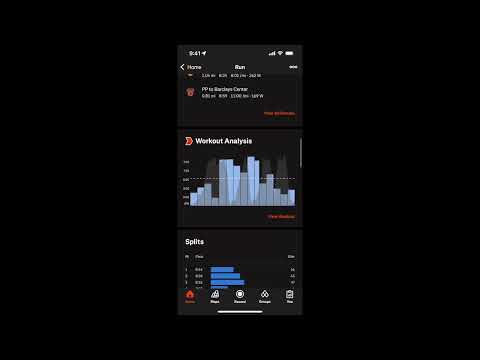
Post-Run
What I Like:
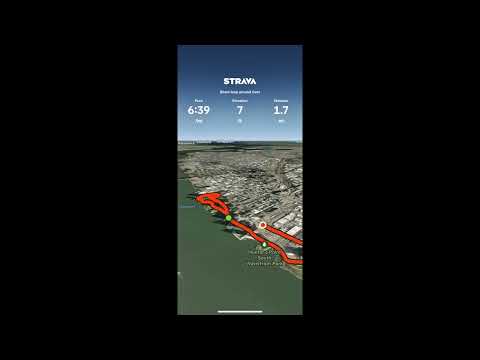
Similar to the post page, all the statistics are awesome. I especially like the PR splits they make for you, like the fastest mile or ½ mile. I don't have much else to say, but I wanted to mention how much I love this Google Map-like visual of my run and speed change throughout. This is a nice analytical feature to see specifically where you may have let off the gas and make a mental note to push harder there next time.
Rating: 10/10
Overall
Strava is an incredible app that is feature-rich and pushes into its social roots really well. I can imagine frequent runners absolutely love this platform.
As you read, some pages are perfect 10/10s, but I do believe there are some opportunities to improve, such as:
- Onboarding: A/B test a side-scrolling format on the notification page to display additional notification types (e.g., monthly stats, new feature updates, community stories). Emphasize motivational notifications (e.g., progress towards leaderboards) to appeal to competitive users.
- Free-Trial Page: Add an opaque background collage of app features to make the page more visually exciting.
- Homepage: Replace vague phrases like "Record an Activity" with visual aids (e.g., live maps). Reorganize the top features: prioritize "Record an Activity" and leaderboards over "Set Goal." Add rotating user-uploaded images as the homepage background to enhance visual appeal and encourage posting. Highlight suggested friends and social integration (e.g., connect contacts, Facebook) prominently on the homepage.
- Who to Follow Section: Retain the “Suggested Follows” section even after following people, updating it dynamically. Replace random influencers with personalized friend suggestions (e.g., contacts or Facebook friends). Add more swipeable profiles to increase engagement.
- Top Buttons: Change the magnifying glass icon for the find friends button to something more intuitive, like a duo icon.
- Map Page: Provide clarity when no moderate or hard routes are available, explaining criteria like elevation.
- Groups: Add a "Find More Clubs" button at the bottom of the screen for users with only one club, or show the "Popular Clubs Near You" section at a reduced height.
Overall, I suspect this will be one of the best-designed apps I will ever review, so if you're looking for an app to study from, I highly recommend giving Strava a hard look.